Join our translation project and help translate Zabbix documentation into your native language.
27 Top items
Overview
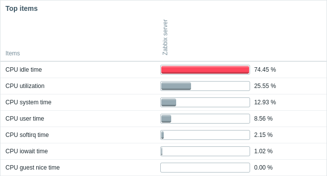
In the Top items widget, you can display top (or bottom) values for a group of items.

It is possible to select items directly or by pattern, customize column ordering and highlighting.
The color of problem items is based on the problem severity color, which can be adjusted in the problem update screen.
By default, only values that fall within the last 24 hours are displayed. This limit has been introduced with the aim of improving initial loading times for large pages of latest data. This limit is configurable in Administration → General → GUI, using the Max history display period option.
Clicking on item value opens the item menu.
Configuration
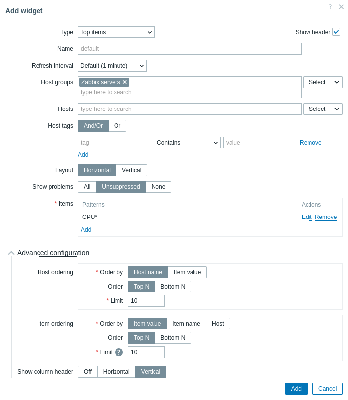
To configure, select Top items as type:

In addition to the parameters that are common for all widgets, you may set the following specific options:
| Host groups | Select host groups. Alternatively, select a compatible widget as the data source for host groups. This field is auto-complete so starting to type the name of a group will offer a dropdown of matching groups. This parameter is not available when configuring the widget on a template dashboard. |
|
| Hosts | Select hosts. Alternatively, select a compatible widget or the dashboard as the data source for hosts. This field is auto-complete so starting to type the name of a host will offer a dropdown of matching hosts. This parameter is not available when configuring the widget on a template dashboard. |
|
| Host tags | Specify tags to limit the number of host data displayed in the widget. It is possible to include as well as exclude specific tags and tag values. Several conditions can be set. Tag name matching is always case-sensitive. There are several operators available for each condition: Exists - include the specified tag names; Equals - include the specified tag names and values (case-sensitive); Contains - include the specified tag names where the tag values contain the entered string (substring match, case-insensitive); Does not exist - exclude the specified tag names; Does not equal - exclude the specified tag names and values (case-sensitive); Does not contain - exclude the specified tag names where the tag values contain the entered string (substring match, case-insensitive). There are two calculation types for conditions: And/Or - all conditions must be met, conditions having the same tag name will be grouped by the Or condition; Or - enough if one condition is met. |
|
| Layout | Select the layout option: Horizontal - host names will be displayed on the left; Vertical - host names will be displayed at the top. |
|
| Show problems | Select how to display problems: All - display all problems; Unsuppressed - only display problems that are not suppressed due to host mainteneance; None - do not display problems at all. Note that when a problem state is represented, it overrides the display style settings from item column configuration. |
|
| Items | Add item patterns or specific items for display (see Column configuration). | |
| Advanced configuration | ||
| Host ordering | Select ordering options for the host column/row. | |
| Order by | Order hosts by: Host name - hosts will be ordered by host name; Item value - hosts will be ordered by the value of selected items. |
|
| Order | Select whether to display the highest or lowest values: TopN - top N values; BottomN - bottom N values. The value of N is selected in the Limit field. |
|
| Limit | Enter limit for displayable hosts (range 1-1000; default 10). This value will become the value of N in the Order field. |
|
| Item ordering | Select ordering options for the item column/row. | |
| Order by | Order items by: Item value - items will be ordered by item value; Item name - items will be ordered by item name; Host - items will be ordered by the selected host pattern. |
|
| Order | Select whether to display the highest or lowest values: TopN - top N values; BottomN - bottom N values. The value of N is selected in the Limit field. |
|
| Limit | Enter limit for displayable items (range 1-1000; default 10). This value will become the value of N in the Order field. |
|
| Show column header | Select column header display options: Off - do not display column header; Horizontal - display text horizontally in the header; Vertical - display text vertically in the header. |
|
Column configuration
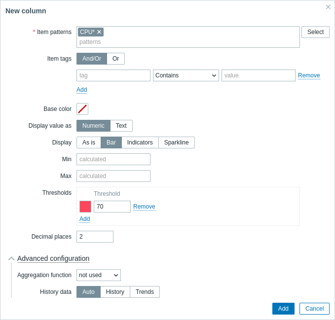
To configure item columns, click Add in the Items parameter:

Common column parameters:
| Item patterns | Specify one or several item patterns, using the wildcard character. Alternatively, select the items. When configuring the widget on a template dashboard, only items configured on the template can be selected. |
| Item tags | Specify tags to limit the number of item data displayed in the widget. It is possible to include as well as exclude specific tags and tag values. Several conditions can be set. Tag name matching is always case-sensitive. There are several operators available for each condition: Exists - include the specified tag names; Equals - include the specified tag names and values (case-sensitive); Contains - include the specified tag names where the tag values contain the entered string (substring match, case-insensitive); Does not exist - exclude the specified tag names; Does not equal - exclude the specified tag names and values (case-sensitive); Does not contain - exclude the specified tag names where the tag values contain the entered string (substring match, case-insensitive). There are two calculation types for conditions: And/Or - all conditions must be met, conditions having the same tag name will be grouped by the Or condition; Or - enough if one condition is met. |
| Base color | Select the column's background color or fill color if Display is set to "Bar" or "Indicators". Note that the base color can be overridden by threshold or highlight colors. |
| Display value as | Format for displaying the item value: Numeric or Text. The selected option determines which additional parameters will be available. Refer to the parameter list for each format below. |
Column parameters for numeric values:
| Display | Define how the value should be displayed: As is - as regular text; Bar - as solid, color-filled bar; Indicators - as segmented, color-filled bar; Sparkline - mini line graph. |
| Min | Minimum value for bar/indicators display. |
| Max | Maximum value for bar/indicators display. |
| Width | Set the graph line thickness by using the slider or manually entering a value in the range from 0 to 10. This parameter is for sparkline display only. |
| Fill | Set fill color transparency level by using the slider or manually entering a value in the range from 0 to 10. This parameter is for sparkline display only. |
| Color | Select line and fill color. This parameter is for sparkline display only. |
| See Advanced configuration for description of fields related to time period and history data selection. | |
| Thresholds | Specify threshold values when the background/fill color should change. The list will be sorted in ascending order when saved. For sparklines, thresholds are applied only to the item last value. |
| Decimal places | Specify how many decimal places will be displayed with the value. |
| Advanced configuration | |
| Aggregation function | Specify which aggregation function to use: min - display the smallest value; max - display the largest value; avg - display the average value; count - display the count of values; sum - display the sum of values; first - display the first value; last - display the last value; not used - display the most recent value (no aggregation). Aggregation allows to display an aggregated value for the chosen interval (5 minutes, an hour, a day), instead of the most recent value. Only numeric data can be displayed for min, max, avg and sum. For count, non-numeric data will be changed to numeric. |
| Time period | Specify the time period to use for aggregating values: Dashboard - use time period of the dashboard; Widget - use time period of the specified widget; Custom - use a custom time period. This parameter will not be displayed if Aggregation function is set to "not used". |
| Widget | Select the widget. This parameter will only be displayed if Time period is set to "Widget". |
| From | Select the time period from (default value now-1h). See relative time syntax.This parameter will only be displayed if Time period is set to "Custom". |
| To | Select the time period to (default value now). See relative time syntax.This parameter will only be displayed if Time period is set to "Custom". |
| History data | Take data from history or trends: Auto - automatic selection; History - take history data; Trends - take trend data. This parameter is available only for numeric item values. For text values data will always be taken from history. |
Column parameters for text values:
| Highlights | Specify the regular expressions upon matching which the background/fill color should change. |
