Join our translation project and help translate Zabbix documentation into your native language.
1 Simple graphs
Overview
Simple graphs are provided for the visualization of data gathered by items.
No configuration effort is required on the user part to view simple graphs. They are freely made available by Zabbix.
Just go to Monitoring → Latest data and click on the Graph link for the respective item and a graph will be displayed.

Simple graphs are provided for all numeric items. For textual items, a link to History is available in Monitoring → Latest data.
Time period selector
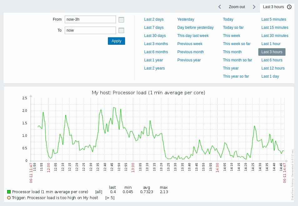
The Time period selector above the graph allows to select often required periods with one mouse click. For more information, see Time period selector.
Recent data vs longer periods
For very recent data a single line is drawn connecting each received value. The single line is drawn as long as there is at least one horizontal pixel available for one value.
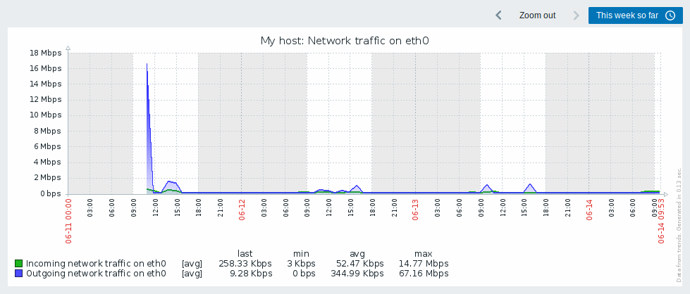
For data that show a longer period three lines are drawn - a dark green one shows the average, while a light pink and a light green line shows the maximum and minimum values at that point in time. The space between the highs and the lows is filled with yellow background.
Working time (working days) is displayed in graphs as a white background, while non-working time is displayed in gray (with the Original blue default frontend theme).

Working time is always displayed in simple graphs, whereas displaying it in custom graphs is a user preference.
Working time is not displayed if the graph shows more than 3 months.
Trigger lines
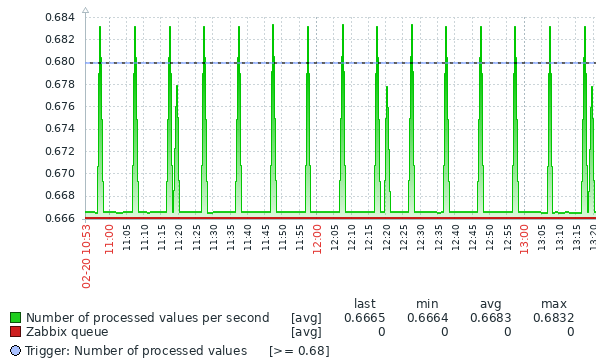
Simple triggers are displayed as lines with black dashes over trigger severity color -- take note of the blue line on the graph and the trigger information displayed in the legend. Up to 3 trigger lines can be displayed on the graph; if there are more triggers then the triggers with lower severity are prioritized. Triggers are always displayed in simple graphs, whereas displaying them in custom graphs is a user preference.

Generating from history/trends
Graphs can be drawn based on either item history or trends.
For the users who have frontend debug mode activated, a gray, vertical caption is displayed at the bottom right of a graph indicating where the data come from.
Several factors influence whether history of trends is used:
- longevity of item history. For example, item history can be kept for 14 days. In that case, any data older than the fourteen days will be coming from trends.
- data congestion in the graph. If the amount of seconds to display in a horizontal graph pixel exceeds 3600/16, trend data are displayed (even if item history is still available for the same period).
- if trends are disabled, item history is used for graph building - if available for that period.
Absence of data
For items with a regular update interval, nothing is displayed in the graph if item data are not collected.
However, for trapper items and items with a scheduled update interval (and regular update interval set to 0), a straight line is drawn leading up to the first collected value and from the last collected value to the end of graph; the line is on the level of the first/last value respectively.
Switching to raw values
A dropdown on the upper right allows to switch from the simple graph to the Values/500 latest values listings. This can be useful for viewing the numeric values making up the graph.
The values represented here are raw, i.e. no units or postprocessing of values is used. Value mapping, however, is applied.
Known issues
See known issues for graphs.
