-#8 What's new in Zabbix 2.0.3
- Frontend improvements
- Flicker-free screens
Previously an automatic page refresh or change in the timeline scrollbar in the monitoring section reloaded the whole page. This was especially visible in screens, where it may take some time for all screen elements to load properly, and the result often was a page where elements jumped around for a while.
Since Zabbix 2.0.3, screens in monitoring do not refresh the whole page, but all the individual elements are reloaded in the background and replaced.
Additionally, image background reloading was implemented in Latest data, graphs and slideshows. This should result in a better user experience and reduced network traffic for all of these pages.
- Displaying of multiple map links
In previous 2.0 versions, map links were not available for editing when multiple elements were selected. Since 2.0.3, it is possible as follows:
- If a single map element is selected, all links that are connected to it are listed
- When multiple map elements are selected, links that connect any two of them are listed

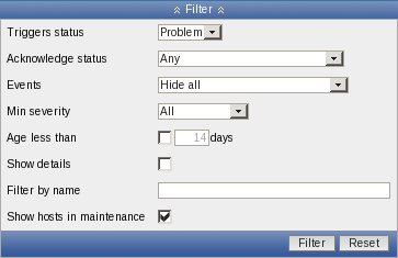
- Filtering triggers by maintenance status
It is possible to filter Monitoring → Triggers page by maintenance status now.

- Improved classic theme tab colours
Previously, classic theme tab colours were slightly confusing. The active tab had grey background, which made it look inactive, while other tabs had light background. This was changed so that the active tab now has a light background, while the inactive ones - blue. Active tab also lost the lower border, so that it indeed looks like one with the visible tab.
 |
Host properties before 2.0.3 |
 |
Host properties since 2.0.3 |
Previous theming was even more confusing when there were two tabs only, and it was not that clear which is the active one.
 |
Web scenario properties before 2.0.3 |
 |
Web scenario properties since 2.0.3 |
- Maintenance indicated by an icon
Previously, maintenance being active was indicated:
- in Monitoring → Triggers - with a string, printed next to the host
- in Monitoring → Dashboard - by colouring host name in orange
In the triggers page this was increasing the cell width considerably, and in the dashboard it did not allow to nicely provide access both to host context menu and maintenance details. This was changed in both locations to use a new icon - orange, round background with white wrench on it.
- Miscellaneous frontend improvements
- In item mass update, field length limits have been extended.
- In availability report, dropdown labels have been renamed from Template and Template group to Host and Host group
- Map links in the editor will now be sorted first by From, then by To element. If a single element is selected, it will be used as From for all links. If multiple elements are selected, for each link the element with the lower selementid will be used for From.
- Performance for the screen, host screen and graph sections was improved.
- All frontend problems visible in Internet Explorer with "Compatibility mode" enabled have been solved
- New translations
- American English
- Chinese (Taiwan)
- Updated translations
- Brazilian Portuguese
- Chinese (China)
- French
- German
- Japanese
- Latvian
- Spanish
- Russian
- Ukrainian
- API improvements
- trigger.get and triggerprototype.get methods have a new parameter expandExpression
- maintenance.get method has a new parameter selectTimeperiods
- Daemon improvements
- Notification macro {ESC.HISTORY} will include remote commands now
- Suffixes "KMGTsmhdw" are now supported in the second parameter of count() trigger function
- Previously it was possible to send large amount of data to the Zabbix server, potentially exhausting memory. This is now limited to accept only 128MB when using Zabbix protocol. Any other data (including older Zabbix protocols) stays limited at 16MB
- Zabbix server and proxy will now retry connections to MySQL if connecting to a DNS name and resolution fails
- When encoding email subject from UTF-8 to Base64, lines longer than 75 bytes will be split up to conform with RFC-2047
- Miscellaneous improvements
Database patch performance for upgrading 1.8 to 2.0 was significantly improved, especially for systems with lots of events.

