Documentation
Table of Contents
6 Gauge
Overview
The gauge widget displays the value of a single item as a gauge.
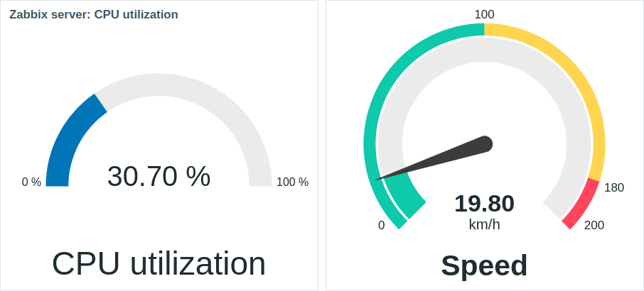
When configured, the widget can consist of the following elements:
- Item description (for example, "CPU utilization", "Speed")
- Item value (for example, "30.70", "19.80")
- Item value units (for example, "%", "km/h")
- Gauge scale (for example, "0%/100%", "0/100/180/200")
- Gauge arc (gauge value arc and gauge thresholds arc)
- Gauge needle
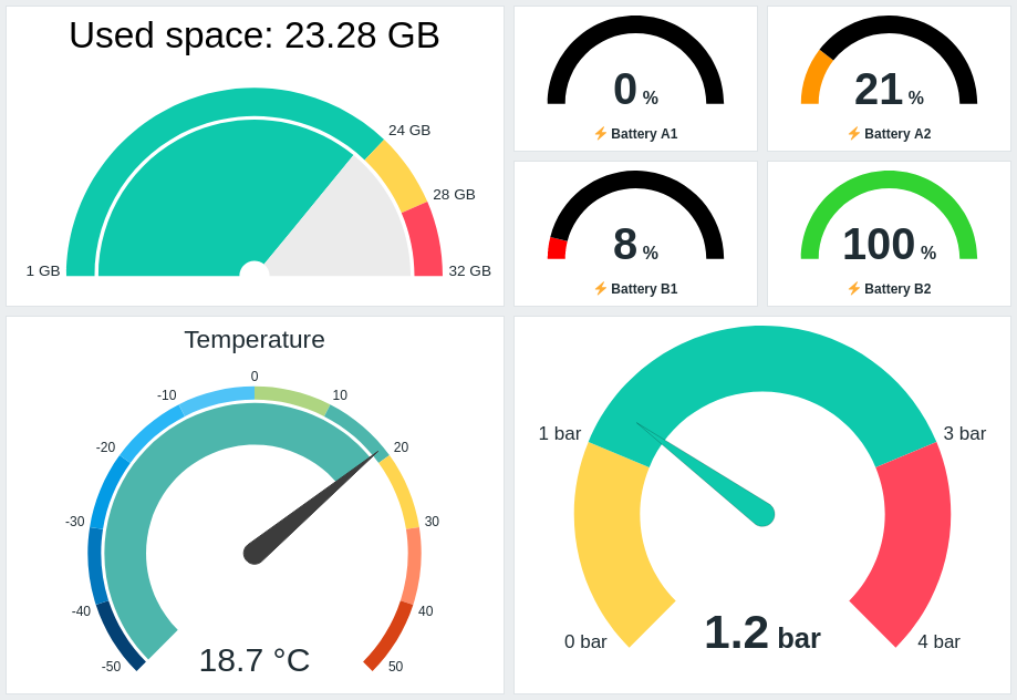
The widget can be visually fine-tuned using the advanced configuration options to create a wide variety of visual styles:
The gauge widget can display only numeric values. Displaying binary values is not supported.
Clicking on the gauge widget leads to a graph for the item.
Configuration
To configure, select Gauge as type:
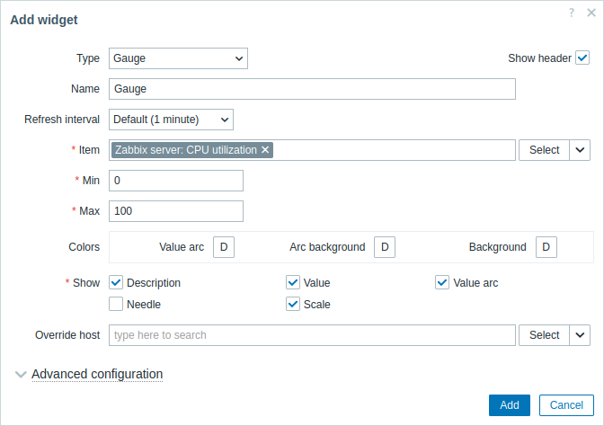
In addition to the parameters that are common for all widgets, you may set the following specific options:
| Item | Select the item. Alternatively, select a compatible widget as the data source for items. This field is auto-complete, so starting to type the name of an item will offer a dropdown of matching items. Note that you can select only items that return numeric data. |
| Min | Enter the minimum value of the gauge. Suffixes (for example, "1d", "2w", "4K", "8G") are supported. Value mappings are supported. |
| Max | Enter the maximum value of the gauge. Suffixes (for example, "1d", "2w", "4K", "8G") are supported. Value mappings are supported. |
| Colors | Select the color from the color picker: Value arc - select the gauge value arc color; Arc background - select the gauge value arc and gauge thresholds arc background color; Background - select the widget background color. "D" stands for the default color, which depends on the frontend theme. If Thresholds are set, the default color for Value arc depends on the threshold color. To return to the default color, click the Use default button in the color picker. |
| Show | Mark the checkbox to display the respective gauge element - description, value, value arc, needle, scale (the minimum and maximum value of the gauge at the beginning and end of the gauge arc). Unmark to hide. At least one element must be selected. Note that the gauge needle and scale can be displayed if the gauge value arc or gauge thresholds arc (see advanced configuration options) is displayed. Also note that if the gauge needle is displayed, the value is placed under the needle; if the needle is hidden, the value is aligned with the bottom of the gauge arc. |
| Override host | Select a compatible widget or the dashboard as the data source for hosts. This parameter is not available when configuring the widget on a template dashboard. |
| Advanced configuration | Click the Advanced configuration label to display advanced configuration options. This is also where you'll be able to adjust the gauge elements selected in the Show field. |
Advanced configuration
Advanced configuration options are available in the collapsible Advanced configuration section:
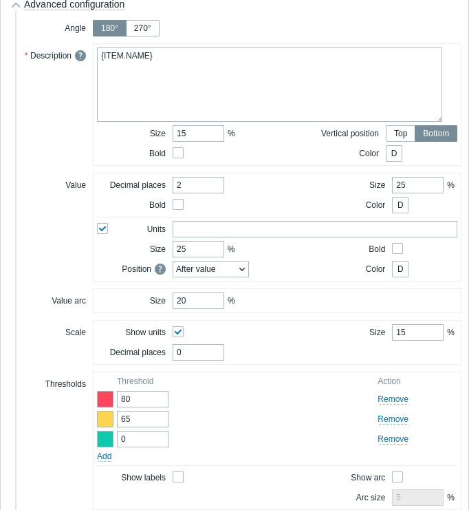
| Angle | Select the gauge angle (180° or 270°). |
| Description | |
| Description | Enter the item description. This description may override the default item name. Multiline descriptions are supported. A combination of text and supported macros is possible. {HOST.*}, {ITEM.*}, {INVENTORY.*} and user macros are supported. |
| Size | Enter the font size height for the item description (in percent, relative to the total widget height). |
| Vertical position | Select the vertical position of the item description (top or bottom, relative to the gauge arc). |
| Bold | Mark the checkbox to display the item description in bold. |
| Color | Select the item description color from the color picker. "D" stands for the default color, which depends on the frontend theme. To return to the default color, click the Use default button in the color picker. |
| Value | |
| Decimal places | Enter the number of decimal places to display with the value. This option affects only items that return numeric (float) data. |
| Size | Enter the font size height for the value (in percent, relative to the gauge arc height). |
| Bold | Mark the checkbox to display the value in bold. |
| Color | Select the value color from the color picker. "D" stands for the default color, which depends on the frontend theme. To return to the default color, click the Use default button in the color picker. |
| Units | |
| Units | Mark the checkbox to display units with the item value. If you enter a unit name, it will override the units set in the item configuration. |
| Size | Enter the font size height for the item units (in percent, relative to the gauge arc height). |
| Bold | Mark the checkbox to display item units in bold. |
| Position | Select the position of the item units (above, below, before or after, relative to the item value). This option is ignored for the following time-related units: unixtime, uptime, s. |
| Color | Select the item units color from the color picker. "D" stands for the default color, which depends on the frontend theme. To return to the default color, click the Use default button in the color picker. |
| Value arc | |
| Arc size | Enter the size height of the gauge value arc (in percent, relative to the gauge arc radius). |
| Needle | |
| Color | Select the gauge needle color from the color picker. "D" stands for the default color, which depends on the frontend theme. If Thresholds are set, the default color for the needle depends on the threshold color. To return to the default color, click the Use default button in the color picker. |
| Scale | |
| Show units | Mark the checkbox to display units with the minimum and maximum value of the gauge. |
| Size | Enter the font size height for the minimum and maximum value of the gauge (in percent, relative to the gauge arc height). |
| Decimal places | Enter the number of decimal places to display with the minimum and maximum value of the gauge. This option affects only items that return numeric (float) data. |
| Thresholds | |
| Thresholds | Click Add to add a threshold, select a threshold color from the color picker, and specify a numeric value. The thresholds list will be sorted in ascending order when saved. Note that the colors configured as thresholds will be displayed correctly only for numeric items. Suffixes (for example, "1d", "2w", "4K", "8G") are supported. Value mappings are supported. |
| Show labels | Mark the checkbox to display threshold values as labels on the gauge scale. |
| Show arc | Mark the checkbox to display the gauge thresholds arc. |
| Arc size | Enter the size height of the gauge thresholds arc (in percent, relative to the gauge arc radius). |
The information displayed by the gauge widget can be downloaded as a .png image using the widget menu:
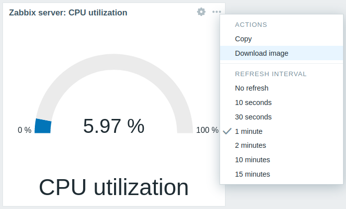
A screenshot of the widget will be saved to the Downloads folder.