16 Item history
Overview
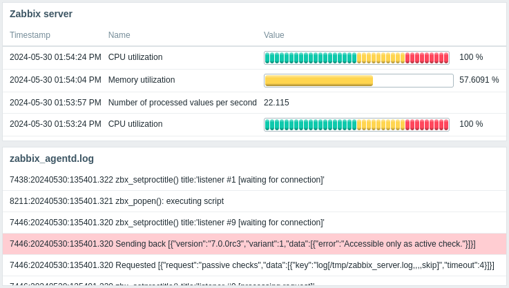
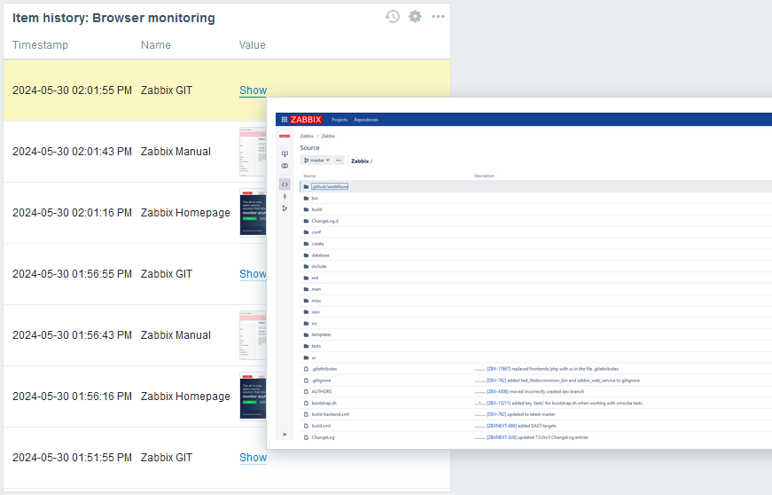
The item history widget displays the latest data for various item types (numeric, character, log, text, and binary) in a table format. It can also show progress bars, images for binary data types (useful for browser items), and highlight values (useful for log file monitoring).


Up to 1000 records can be displayed.
Configuration
To configure, select Item history as type:

In addition to the parameters that are common for all widgets, you may set the following specific options:
| Layout | Select the layout option for item columns: Horizontal - items will be displayed horizontally, values vertically; Vertical - items will be displayed vertically, values horizontally. |
| Items | Add item columns to display. The order of items determines their display order. Items can be reordered by dragging them up or down by the handle before the item name. |
| Show lines | Specify the number of item value lines to display. |
| Override host | Select a compatible widget or the dashboard as the data source for hosts. This parameter is not available when configuring the widget on a template dashboard. |
| Advanced configuration | Click the Advanced configuration label to display advanced configuration options. |
Column configuration
To configure item columns, click Add in the Items parameter:

Common column parameters:
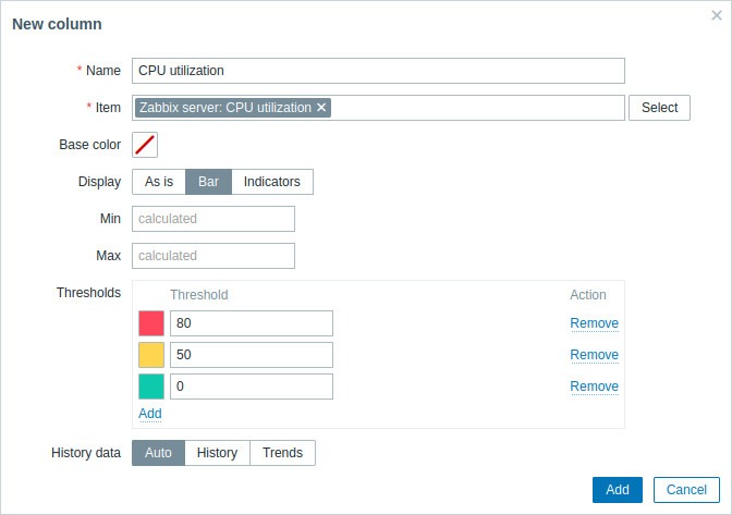
| Name | Enter the name of the column. If left empty, the item name from the Item parameter is used. |
| Item | Select the item. Note that column configuration parameters vary based on the information type of the selected item; for more information, see individual parameters below. When configuring the widget on a template dashboard, only items configured on the template can be selected. |
| Base color | Select the column's background color or fill color if Display is set to "Bar" or "Indicators". Note that the base color can be overridden by threshold or highlight colors. |
Column parameters specific to numeric type items:
| Display | Select how the item value should be displayed: As is - as regular text; Bar - as solid, color-filled bar; Indicators - as segmented, color-filled bar. |
| Min | Enter the minimum value for bar/indicators. If left empty, the widget will use the minimum value of the item. This parameter is available only when Display is set to "Bar" or "Indicators". |
| Max | Enter the maximum value for bar/indicators. If left empty, the widget will use the maximum value of the item. This parameter is available only when Display is set to "Bar" or "Indicators". |
| Thresholds | Click Add to add a threshold, select a threshold color from the color picker, and specify a numeric value. The thresholds list will be sorted in ascending order when saved. Suffixes (for example, "1d", "2w", "4K", "8G") are supported. Value mappings are supported. |
| History data | Select whether to take data from history or trends: Auto - automatic selection; History - take history data; Trends - take trend data. |
Column parameters specific to character, text, and log type items:
| Highlights | Click Add to add a highlight, select a highlight color from the color picker, and specify a regular expression. The selected color will be used as the background color for item values where the specified regular expression matches the text. |
| Display | Select how the item value should be displayed: As is - exactly as received. Line breaks are preserved if the value contains line returns. Word wrapping is applied if Layout is set to "Vertical" and more than one column is configured; HTML - as HTML-formatted text; Single line - as a single line, truncated to a specified length (1-500 characters). Hovering or clicking on the truncated value opens a pop-up with the full value. |
| Use monospace font | Mark this checkbox to display the item value in monospace font (unmarked by default). |
| Display local time | Mark this checkbox to display local time instead of timestamp in the timestamp column. Note that the Show timestamp checkbox in advanced configuration must also be marked. This parameter is available only for log type items. |
Column parameters specific to binary type items:
| Show thumbnail | Mark this checkbox to display a thumbnail for image binaries or a "Show" option for non-image binaries. Unmark this checkbox to display a "Show" option for all binary item values. Hovering or clicking the "Show" option opens a pop-up window with the item value (image or Base64 string). If the item value is an empty string, the "Show" option is displayed; hovering or clicking it opens a pop-up containing "Empty string". |
Advanced configuration
Advanced configuration options are available in the collapsible Advanced configuration section:

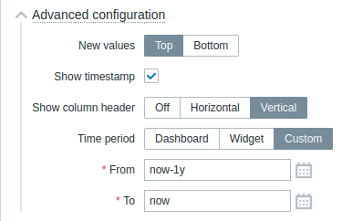
| New values | Select where new item values should be added: Top - at the top of columns; Bottom - at the bottom of columns. |
| Show timestamp | Mark this checkbox to display the timestamp column (unmarked by default). |
| Show column header | Select the column header orientation: Off - hide the header; Horizontal - display the header horizontally; Vertical - display the header vertically. |
| Time period | Select the data source for the time period: Dashboard - set the Time period selector as the data source; Widget - set a compatible widget specified in the Widget parameter as the data source; Custom - set the time period specified in the From and To parameters as the data source; if set, a clock icon will be displayed in the upper-right corner of the widget, indicating the set time on mouseover. |
| Widget | Enter or select a compatible widget (Graph, Graph (classic), Graph prototype) as the data source for the time period. This parameter is available if Time period is set to "Widget". |
| From | Enter or select the start of the time period. Relative time syntax ( now, now/d, now/w-1w, etc.) is supported.This parameter is available if Time period is set to "Custom". |
| To | Enter or select the end of the time period. Relative time syntax ( now, now/d, now/w-1w, etc.) is supported.This parameter is available if Time period is set to "Custom". |

